Before we even get started… we just want you to know that we are head over heels in LOVE with all 45 trend colors for 2020. One of the reasons we love this mix of colors so much is that there is such a variety of design styles these colors fit into! Even if you’re not super comfortable working with color, you can pick 2-3 colors from these palettes to sprinkle throughout your home. We honestly don’t think you can go wrong with a blend of these colors!
The Theme for 2020 is Color in Balance
Sherwin Williams introduces 45 trend colors, spun into five welcoming and intuitive palettes that bring joy, serenity and focus to the mind, body and spirit… and we are here for it.
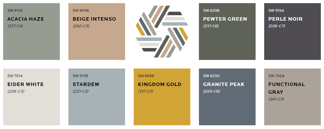
MANTRA
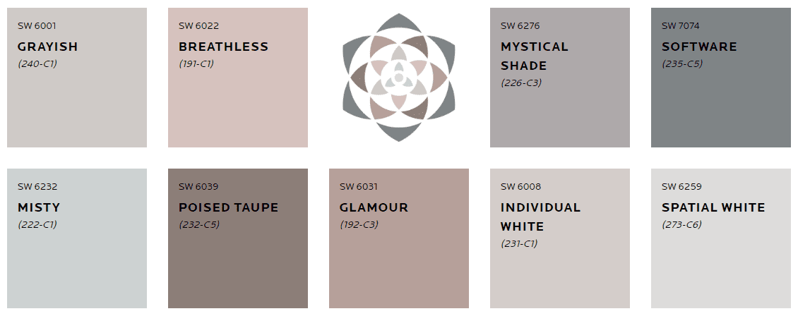
East meets West in this palette, and both styles have entwined in the most appealing way. Now Nordic simplicity happily engages with the order and elegance of Japanese aesthetics to create a look that is the best of both worlds. With softly muted neutrals that glide from warm to cool, it embraces all that is simple yet utterly essential.
Influences: Minimalism, Serenity, Scandinese, Sanctuary
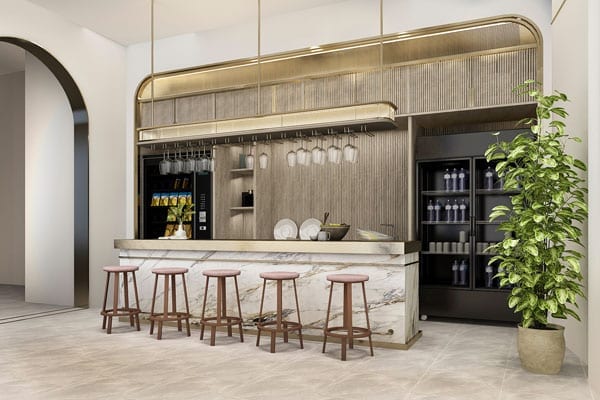
Here is an example of how you can use colors from MANTRA in your home:
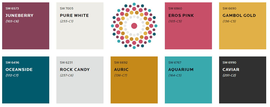
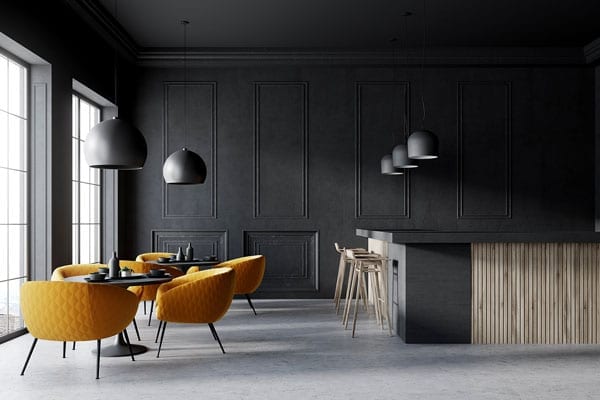
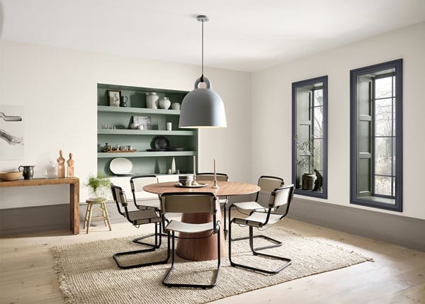
HEART
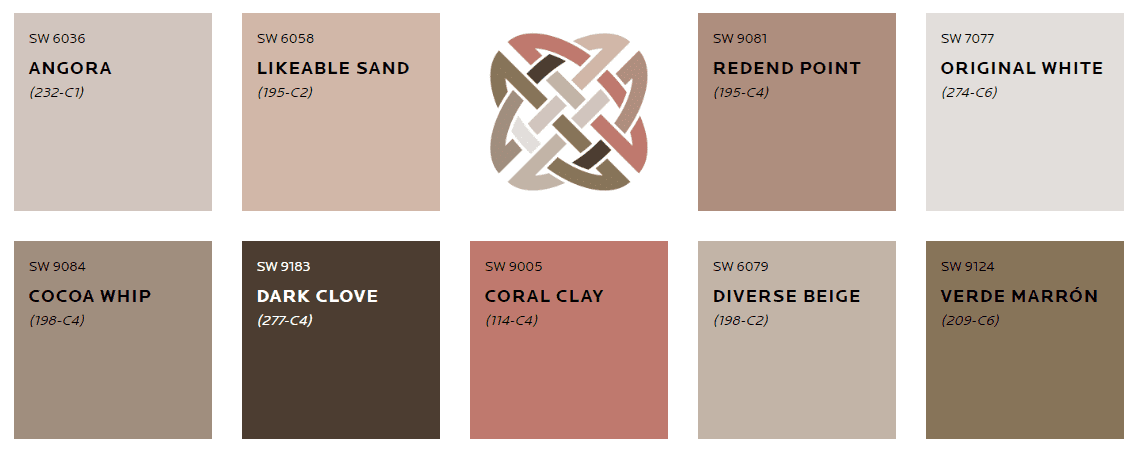
A confluence of genres and emotions permeates this palette. It’s a unique fusion of iconic modern design mixed with an intergenerational boho vibe. The result is a collection of colors that harmonize amazingly well. From silky earth tones to clove and soft coral, these nine colors are a meditation on comfort, connection and the pleasures found in the everyday.
Influences: Bauhaus, Bohemian, Fusion, Humanity
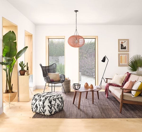
Here is an example of how you can use colors from HEART in your home:
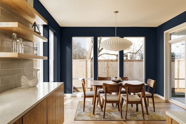
ALIVE
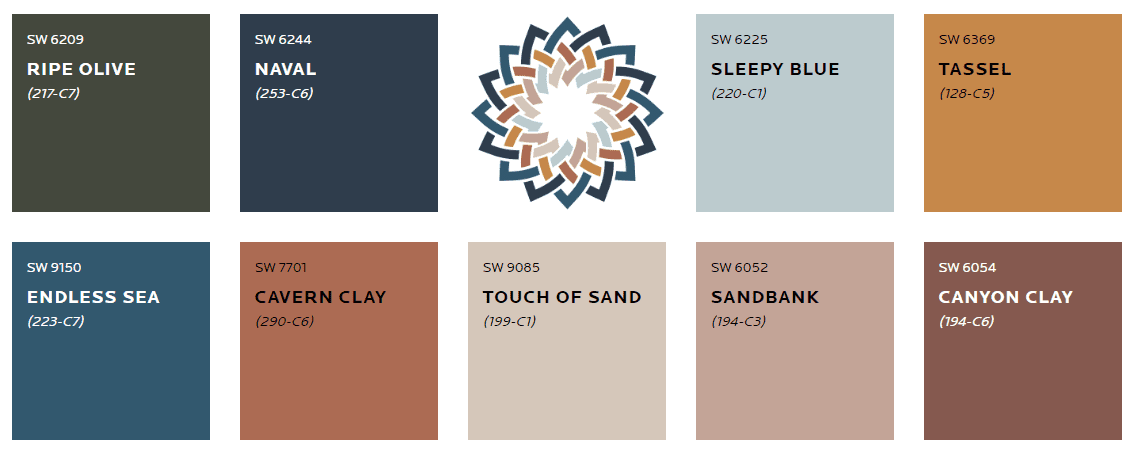
Be present. Be positive. And relish the moments of this amazing life. Enjoy it in an authentic space touched by a palette whose colors keep good company. Here, nurturing neutrals are artfully arranged with rich blues and a deep, ripe olive, evoking a satisfying and rejuvenating sense of community and living well.
Influences: Optimism, Authenticity, Glocalization, New Local
Here is an example of how you can use colors from ALIVE in your home:
PLAY
Tag. You’re it. These buoyant colors extend an invitation to jump into the game and have fun. Energetic and clever, this palette packs a lot of charm. Starting with a fresh, pure white, it’s peppered with surprising pops of brightness. Its mission is to add humor and warmth to all it touches — and to help us recall that deep down, we’re still kids who love to play.
Influences: Escapism, Humor, Joy, Energy
Here is an example of how you can use colors from PLAY in your home:
HAVEN
Like being welcomed home with open arms, this palette beckons to those seeking an oasis. Inspired by Earth’s seasonal cycles, it features richly subtle shades of sea, sand, forest and sky. An innate reminder that sometimes real beauty lies in the spaces outside the lines and calm comes from knowing perfect isn’t the only way to be.
Influences: Simplicity, Wabi-Sabi, Conservation, Material Health
Here is an example of how you can use colors from HAVEN in your home:
There you have it, your color forecast for 2020! If you’re in the market for a kitchen or bathroom remodel for 2020, definitely take these colors into consideration because you’ll see them pop up a lot in cabinetry!
All images via Sherwin Williams.
-Makenna Ewan, Kitchen & Bath Designer